Let’s face it. Our obsession with the internet has gotten out of hand.
We’re spending more time online than ever before. Every spare moment is spent in front of a screen—whether it’s checking our email in bed, Facebook on the train or Twitter in the toilet (come on, admit it). And the explosion in mobile this decade means that we are always online, to some degree.
On top of that, we are constantly bombarded with notifications—likes, retweets, favourites, friend requests, alerts. And 'shiny-new-object syndrome’ is always drawing us towards the newest gadget or app.
On average:
- An adult will spend over 5 hours per day online
- Workers send and receive 40 email per day, and an estimated 20 notifications
- People visit over 10 websites per day
- A smartphone user will picks up their phone more than 1,500 times in any week
The stream of information flows like a sip from a firehouse and we can’t stop it. Even if we wanted to. And it’s getting us nowhere.
Jack Cheng calls this the era of the ‘Fast Web’:
What is the Fast Web? It’s the out of control web. The “oh my god there’s so much stuff, I can’t possibly keep up” web. It’s the “spend two dozen times a day checking” web. The “in one end and out the other” web. The web designed to appeal to the basest of our intellectual palettes, the salt, sugar and fat of online content web. It’s the scale hard and fast web. The “create a destination for billions of people” web. The you have two hundred twenty six new updates web. Keep up or be lost. Click me. Like me. Tweet me. Share me. The Fast Web demands that you do things and do them now. The Fast Web is a cruel wonderland of shiny shiny things.
And you know what? Things are going to get worse before they get better. The advances in new technologies around home automation will only add to the noise. Soon your alarm clock will be talking to your coffee machine, and you’ll get a notification about it. And wearable technology means we’ll never be completely off the grid.
It’s not just us, it’s our children too. Leading paediatricians suggest that kids should spend no more than 2 hours per day in front of a screen. Yet, they too are obsessed. The task of keeping a child away from an ipad is sisyphean.
'Internet addiction disorder’ is now recognised as a legitimate clinical disorder, with its own wikipedia page. And don’t get me started with 'Phantom vibration syndrome’.
It can’t go on like this. The fast web is killing us.
The first step to recovery is admitting we have a problem. But what’s the solution?
The slow web: the antidote to our fast-web woes.
Imagine a web that wasn’t so rushed. A web that empowered us to consume it in a more leisurely fashion. A web that felt more like a farmers market than a hyper market. Perhaps even a web that encouraged you to disconnect from time to time.
You’ve heard of slow food, but have you heard about the slow web movement?
Again, I’ll allow Jack to explain:
The Slow Web Movement is a lot like the Slow Food Movement, in that they’re both blanket terms that mean a lot of different things. Slow Food began in part as a reaction to the opening of a McDonald’s in Piazza di Spagna in Rome, so from its very origin, it was defined by what it’s not. It’s not Fast Food, and we all know what Fast Food is… right?
We spend way too much time eating fast-food online. Facebook is the cheeseburger of the web. Twitter is the chicken nugget. We need to cut down on quarter-pounders, and we need to spend less time the fast-web too.
I think 2015 will be the year of the slow web. And together we can help build it.
Designing for a slower web
As designers, we’ll never win over our users if we’re constantly hassling them with more notifications and email updates.
The slow web is the opposite. It’s about getting out of our user’s way. It’s about reducing the noise, not adding to it. It’s about providing real quality, not quantity. It’s about turning down the volume, and letting our users enjoy the quiet.
So how might we design for the slow web? By showing you some examples below, I hope provide some ideas into how we can do it.
Do less, but better
As designers and product people, we’re under constant pressure to give more. More content, more features. More updates.
We need to get off this hamster wheel and aim to give our users more by giving them less. Focusing on producing more quality, not more quantity.
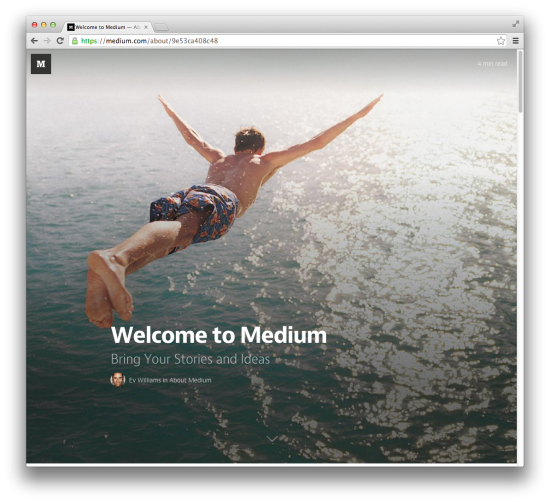
Probably one of the early winners of the slow web movement is Medium. It’s the writing platform that that has made long-form reading popular again. Medium has developed a community of quality writing and imagery from its contributors. It feels more like blogging for the slow web.
Designing for a slower web is also about making things simpler and intuitive without draining our cognitive resources. Let’s think about reducing features, and delivering fewer, but better, updates so that we can get out of our users’ way sooner.
Hold back on notifications
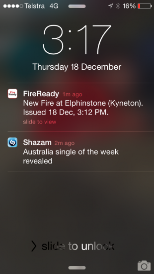
Here are two notifications I received today. The first one was from Fire Ready app, alerting me of a fire near my home. An important message that I’m interested in knowing about and that I opted-in to. The second was an irrelevant message from Shazaam that I never signed up for.
Guess which one pissed me off the most?
In a quest to get users to to form long-lasting habits with our products, we’re bombarding our user base with shit and dribble. The Android design guide puts it more politely:
Unwanted or unimportant notifications can annoy the user or make them resent how much attention the app wants from them, so use notifications judiciously.
Next year, let’s be more strategic about using notifications. Let’s make sure that the notifications we send are:
- Crucial - information that the user must see.
- Expected - make sure that your users have clearly opted in to your notifications, and are expecting your message.
- Timely - Don’t send notifications in the middle of the night. Send notifications at a time that is most useful for your user.
Or, perhaps, we shouldn’t send any at all.
The web on my watch
One of the biggest problems with the fast web is the enormous sense of immediacy. The Dopamine hit. The sense that something is out of date when it’s five minutes old. And the need to ‘stay up to date’ is a major cause of anxiety. At least for me.
A slower web should reduce immediacy. It should allow people to take use it on their terms, and at a time that suits them.
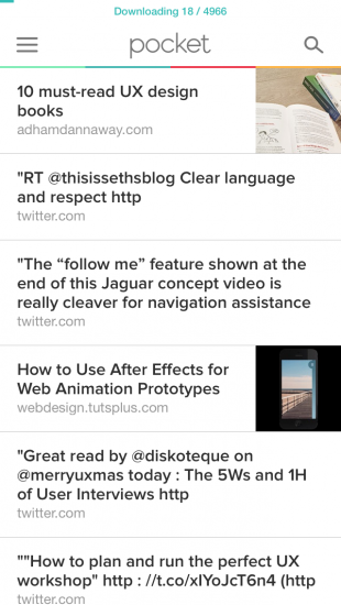
One of my favourite web applications is Pocket. Much like Instapaper before it, Pocket allows me to save articles and blog posts to for later reading. I can read saved articles whenever I choose, even when I’m offline. This save-for-later feature gives me a greater control over the web I consume, and also where and when I consume it.
Likewise, we should be creating experiences that fit a little better into the rhythm of our users’ lives. Don’t just think about how and why—understand the cadence of your experience, and give your users control over when, and how often, they interact with you.
Send them outside
As slow web designers, perhaps we should be encouraging our users to spend less time using our apps. Less time in front of screens.
There are some great examples of technology that do this well.
Firstly, there’s Strava, a run-tracking app that’s all about getting you outside to run or ride.
Or Moment. Moment is an iOS app that automatically tracks how much you use your iPhone and iPad each day - and actively encourages you to turn off.

And then there’s Toymail. Toymail make wi-fi connected toys that encourages your kids to express themselves and communicate with family digitally, but without the screen exposure. Using an Android or iOS app, you can send messages to your children, via the Mailmen toys - like snort here.
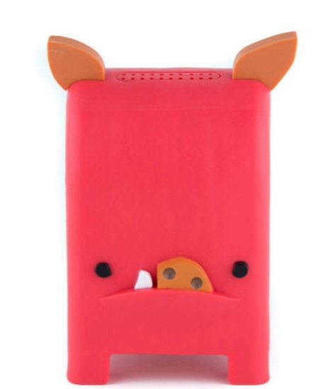
Kids can also reply right back, again via the toy. So it’s a two-way conversion that doesn’t happen over a screen.
Are there ways that you can encourage your users to stop, unplug, and smell the roses?
Respect thy user
Ultimately, designing for the slow web is about showing respect for our users.
Your users are probably very busy people, with constant distractions in their lives. So make sure you're always respecting their time. Never be a distraction to your user’s already-busy day. Never be pushy.
A slower web should reduce the noise and informational clutter, not add to it. So next time you’re adding a feature, or sending out a notification, ask yourself, “Is this interaction or this touch-point truly going to make my user’s day better?”
If not, why do it?