A former colleague of mine showed me an article that compared paper prototyping to macaroni artwork commonly found at your local preschool. The article, Paper prototyping is a waste of time, by Jake Knapp, discusses the author’s belief that paper prototypes should never see the light of day, let alone be used for testing.
I vehemently disagree with this thinking.
The article shows a narrow perspective and completely overlooks the value paper prototyping holds when done effectively. We don’t just scribble on paper and then ask the user if they’re OK with it. The author failed to account for the various UX roles and environments we find ourselves in. Sometimes we have to use those creative problem-solving skills beyond our latest project to determine how we can work effectively with what we have. There are at least two sides to every story and respectfully Jake, you and I need to talk.
Here’s why.
3 reasons we use paper prototypes
We don’t all have the same resources
Not all organisations and professionals have the same resources when it comes to prototyping. Some of us may like to just download a fun new rapid prototyping tool, but we simply don’t have the required administrative permissions to carry out such tasks. And not all designers have access to the latest hardware, let alone anything less than five years old. Furthermore, not all organisations place the same level of value on UX and it is still a widely misunderstood field in many of these workplaces. People who haven’t worked with designers before often see us as expensive blockers who get in the way of productivity and don’t affect the project outcomes. In some cases, we have to prove and test our ideas with users before we’re given any funding and paper prototypes are a lifesaver. They give us the opportunity to obtain valuable user insights while still walking within the lines of any resource constraints we may be facing.
Paper prototypes save time
It’s true they do and no, it’s not because they’re quick to make. Think about the bigger picture for a moment. What happens when ideas are not tested and refined early in the game and make it all the way to build and implementation? More often than not you’re left with a product that is not fit for purpose and the process has to start all over again. That takes time and lots of money. Paper prototypes allow us to get our not-so-great ideas out of our systems early and move on to spend more time on the good stuff!
Users are more likely to give honest feedback on work that is less resolved
Users feel more comfortable taking to a paper prototype with a red pen rather than a high fidelity prototype. Why? Presenting a user with a beautiful, glossy high fidelity prototype can be intimidating! Sometimes users feel less inclined to provide that brutal honesty you’re looking for out of fear of ruining all your hard work. Giving them something less resolved to work with and eliminate this issue.
3 techniques that work
Flip out
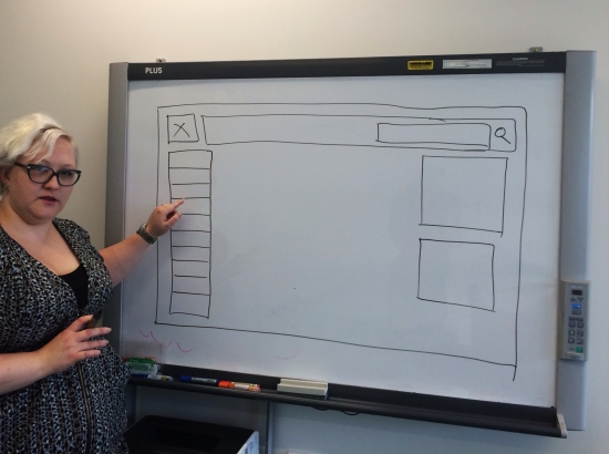
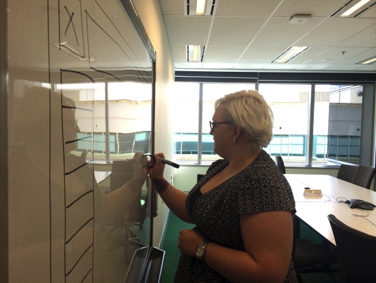
A paper prototype doesn’t have to be a masterpiece. It can be as simple as hand drawn screens and a flipchart with an adhesive edge (it is like a giant post it note!) This works well for both websites and mobile apps. Break out the markers and draw each screen on separate sheets of paper. Stick them to a table and flip up to the relevant ‘screen’ as you run the evaluation session. Don’t like paper? Find yourself a whiteboard and even better, use an electronic one that has multiple scrolling screens and a printer attached. This is especially useful for co-design sessions because the user can communicate their ideas by drawing on it and you can print it out after each session. Just make sure you take note of which drawing is on which whiteboard screen to help you navigate between them!
Think big
This one is a lot of fun! Print out A3 size pieces (e.g. web parts) of your prototype and arrange them on a large wall space to create a supersized version of your work. This is especially good if your design is constrained by specific web elements that you have no choice but to include. I like this technique because it allows you to create a large, sweeping display that you can step back from and take in. This technique is also great for testing workflows and the natural order of things. When testing, have your user rearrange the elements on the wall and talk you through their thinking. Add comments using post it notes and record each iteration made by the user by taking photos. If you can, leave it pinned to the wall after testing and hold a meeting with your stakeholders at that wall and explain it to them.
Size matters
This technique works well with mobile apps especially when you don’t have a mobile device handy to test with and you’re not allowed to use your own. Start by creating a life size template of a mobile device in Adobe Illustrator, Microsoft PowerPoint or Microsoft Word. All it has to be is a black rounded rectangle with a white space in the middle of the screen. You can digitally build your screen inside the white box and then print it or you can print it out blank and draw it in. After you’ve done that, cut out the mobile device shape so it fits in your hand and take that to testing. Being true to size, this method allows you to test button sizes and thumb reach on a three dimensional object without having to track down a real one! It’s also nice to take a few blank ones to the evaluation session so that the user can add their own screens or re-design yours.
3 tips for success
Rethink your testing strategy
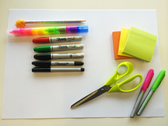
Think outside the usability evaluation and use your paper prototype as a conversation starter. Hold a co-design session with both stakeholders and users in the room and run group activities to create the next iteration. Involving stakeholders in co-design activities will not only increase their appreciation of the design process, but will also allow them to interact directly with users. Another option is to pin your prototype up on a wall near a busy walkway and encourage anyone and everyone to provide feedback as they walk past. Yes, that includes random strangers. Why? Because they aren’t wedded to your project like you might be and they have fresh eyes which equals fresh ideas! Pin up a blurb about your project beside it and leave an assortment of post it notes and markers for them to use. Stand back and watch the wall take on a life of its own!
Facilitation changes everything
The key to a successful usability evaluation with a paper prototype is good facilitation. The prototype is important, but the conversation with the user is where the real treasure lies. Plan ahead and prepare scenarios for the user to work through and structure the session around discussion-based activities. Encourage your user to think aloud during the session and ask them questions.

Keep it simple
If in doubt, leave it out! Quick and dirty is the name of the game, so don’t waste time going overboard. Keep your prototype simple and communicate your ideas clearly. Remove anything that does not add value and focus on expanding upon the idea itself.
Jake’s article concludes with the suggestion that those who test with paper prototypes should ‘get real’. I think the author is the one in need of a healthy dose of reality. We certainly don’t live in a perfect world but hey, as UX Designers we do have the skills to work around obstacles and still produce meaningful experiences for our users, even if a ream of paper had a starring role. At the end of the day, that is why we turn up to work and do what we do. Also, let’s not forget there’s entire world of UX out there that has nothing to do with digital, but that is a story for another time.


