As a User Experience Designer, the people in my life have come to the well-founded conclusion that if I spot something that nags at me because of usability issues, I will point them out. Sometimes repeatedly.
We all encounter designs on a daily basis that could have been better thought through, and I'd like to share with you my daily journey through these encounters.
First stop, transport.
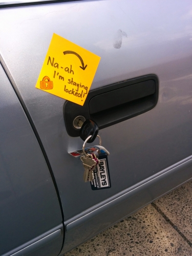
I usually take the bus to get to and from places, but we also have a car. We have had this car for almost 6 months and I still can’t remember how to open the door on the first try!
Some of you may laugh at this and I would have to agree that it seems like a ridiculous statement. We laugh at ourselves every time we get it wrong. It is as though the car has a personality of its own and is silently counting…
Car: 140, Car's owners: 0
But our car isn’t normal, I swear!!
To unlock the car doors, you need to turn the key anti-clockwise and to lock it you turn the key clockwise. This goes against our mental models of how things are supposed to work. It is such an ingrained concept that re-training simply isn’t happening.
So once I finally manage to open the door, I then head off to work…
The Coffee Machine
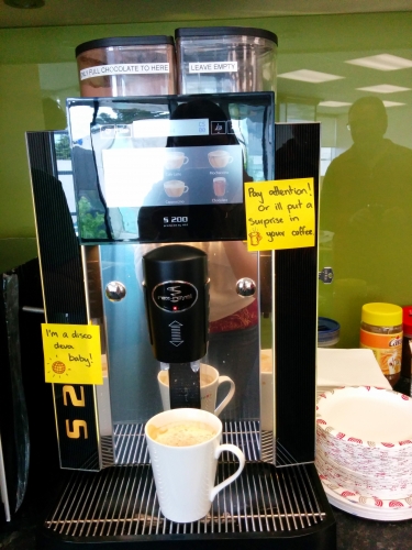
Now like many professionals, I’ve become somewhat of a coffee junkie. The main coffee machine in my workplace kitchen is very techno. Seriously. It changes colours, cycling through all the colours of the rainbow.
If you push the buttons to get your drink, then walk away to do something else in the meantime, this wonderful coffee machine will give you a special treat. It beeps once, then goes through a rinse cycle, spitting watery milk into the unsuspecting cup below. Yum! Not.
We’re teaching people to be on to it, of course and pay attention, but if you don't get to your cup in time, your coffee basically turns into machine spit.
My Filing Cabinet
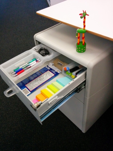
After I’ve safely rescued my coffee cup I meet my next battle.
My filing cabinet.
My lovely filing cabinet will only allow you to open one draw at a time. If another door is open even a smidgen, you can’t open any other draw. You also have to pull, quite forcefully at times, to open it.
But my design woes don't end at the working day, oh no. When I return home, there are many more to contend with.
The Friendly Kitchen Sink Tap
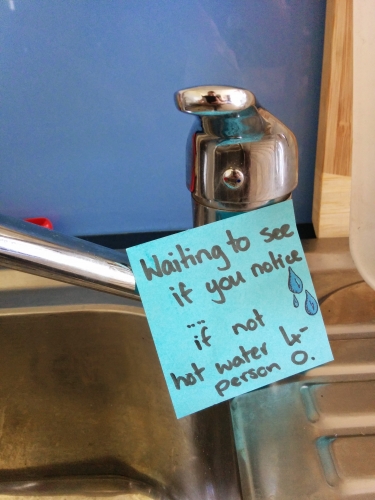
Now I will be the first to admit, that this one isn’t the tap’s fault. This an installation problem, but I thought I would include it just the same.
Generally taps have some kind of colour indicator showing you which direction is hot and which is cold. My friendly kitchen tap has that, but the person who installed it didn’t check before they put it in, and put it the wrong way. So red is cold and blue is hot.
This one is a little easier to re-train my mental model because it comes with additional cues, for example, the cold water comes out of the tap faster. But when I first moved in, especially on morning when I'm half asleep, I have managed to get this wrong and get scalded.
Shop Doors
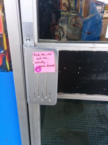
Last but not least, I think this one is very common and many people may have run in to this one (sometimes quite literally - sorry). Here we have the door to our video store.
I suppose you could forgive this door because it has a very worn out PUSH sign that you can barely make out, but I never read it fast enough to stop my blunder.
My mental model associates handles like this with something you pull, not push, even though this is a common design with doors. Generally you can get away with the pattern because there tend to be other discernible features that allow a person to pick up the direction the door will swing. But this is not always the case and can still be quite frustrating.
But is there a Silver Lining in Bad Design?
Now that I’ve taken you through a small part of my daily design confusions, some that may match your own, and others that may be new, I would like to add one last thing.
Although these things have shown bad design decisions, I think that we need some bad design in our world. It helps drive those of us inclined to design, to create better experiences, to think, explore, and ruminate on how things could be done differently.
It helps point out how important good design is, and how noticeable bad design decisions are.

